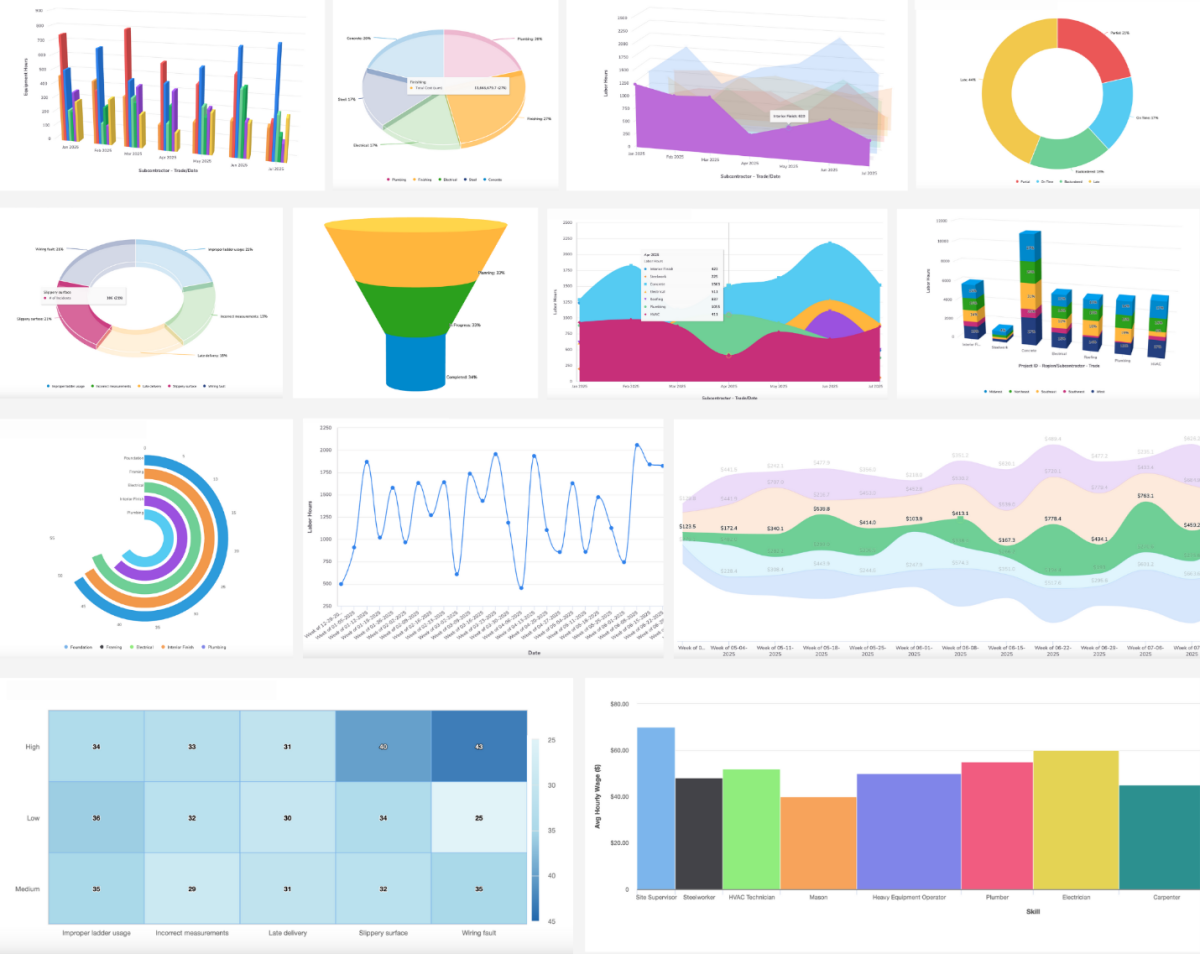
15 new chart types to give you more effective ways to visualize and share your data:
- Spline and area spline – smooth, curved lines for trend analysis
- Donut chart – a circular variant of the pie chart with a modern aesthetic
- Streamgraph – good for showing changes over time across categories
- Radial bar – circular bar charts for compact visualizations
- Bullet chart – good for comparing performance against benchmarks
- Variwide chart – variable-width columns showing impact alongside quantity
- Heatmap – good for visualizing density or intensity, like resource allocation or performance across time and categories
- 3D Visualizations:
- 3D bar, stacked bar, pie, donut
- 3D area, scatter, funnel