The upcoming release of TaskOp includes several quality-of-life improvements across the platform, with key updates like enhanced navigation controls and improved data visualization methods. These changes will make it easier to find critical information and display that information more clearly on your screens.

Navigation Menu Bar:
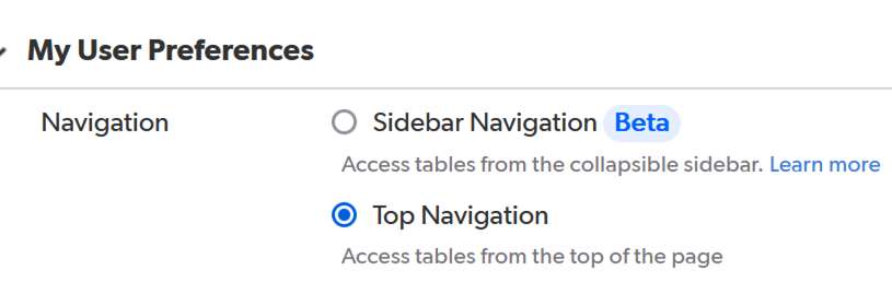
In previous versions, the Navigation Bar was at the top of the screen. With this update, it has moved to the left side and is now collapsible, providing more space for data visualization and interaction. This consistent navigation format will enhance access to data across all pages.
To switch to the new user interface:
- Click on your name in the upper right corner of the screen and select “My Preferences.”
- Your preferences page will load, with “Navigation Preference” as the first item on the list. The default setting is the old top navigation.
- To switch to the Sidebar Navigation (beta), select the radio button for “Sidebar Navigation.”
- Click the green “Save” button in the upper right corner.
- To return to your app, click on the 9 dots in the upper left corner and select your app from the pop-out box


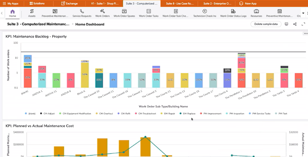
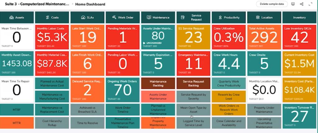
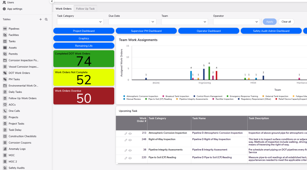
Dashboard Enhancements
Next up are enhancements to TaskOp’s dashboards, including new data visualization tools like KPI metrics and dynamic filtering. These updates allow for more customization in how data is presented.
Key features include:
- Multiple tabs to segment data, eliminating the need to switch between separate dashboards.
- The ability to filter dashboard data dynamically, similar to individual reports.
- Large data tables combined with KPIs for a quick overview of project status.
This update offers greater customization in the layout, design, and number of KPIs users can track and display. Users can create an ideal layout for their KPIs, further boosting project success and management efficiency.
Reach out to your RCP TaskOp team to get these new dashboards installed in your application.